HMI Designer
HMI Designer is a built-in feature inside OEVIS which allows users to design and customize their application's front end.
To access the HMI designer, simply click on 
HMI button from the top toolbar in the Job panel.
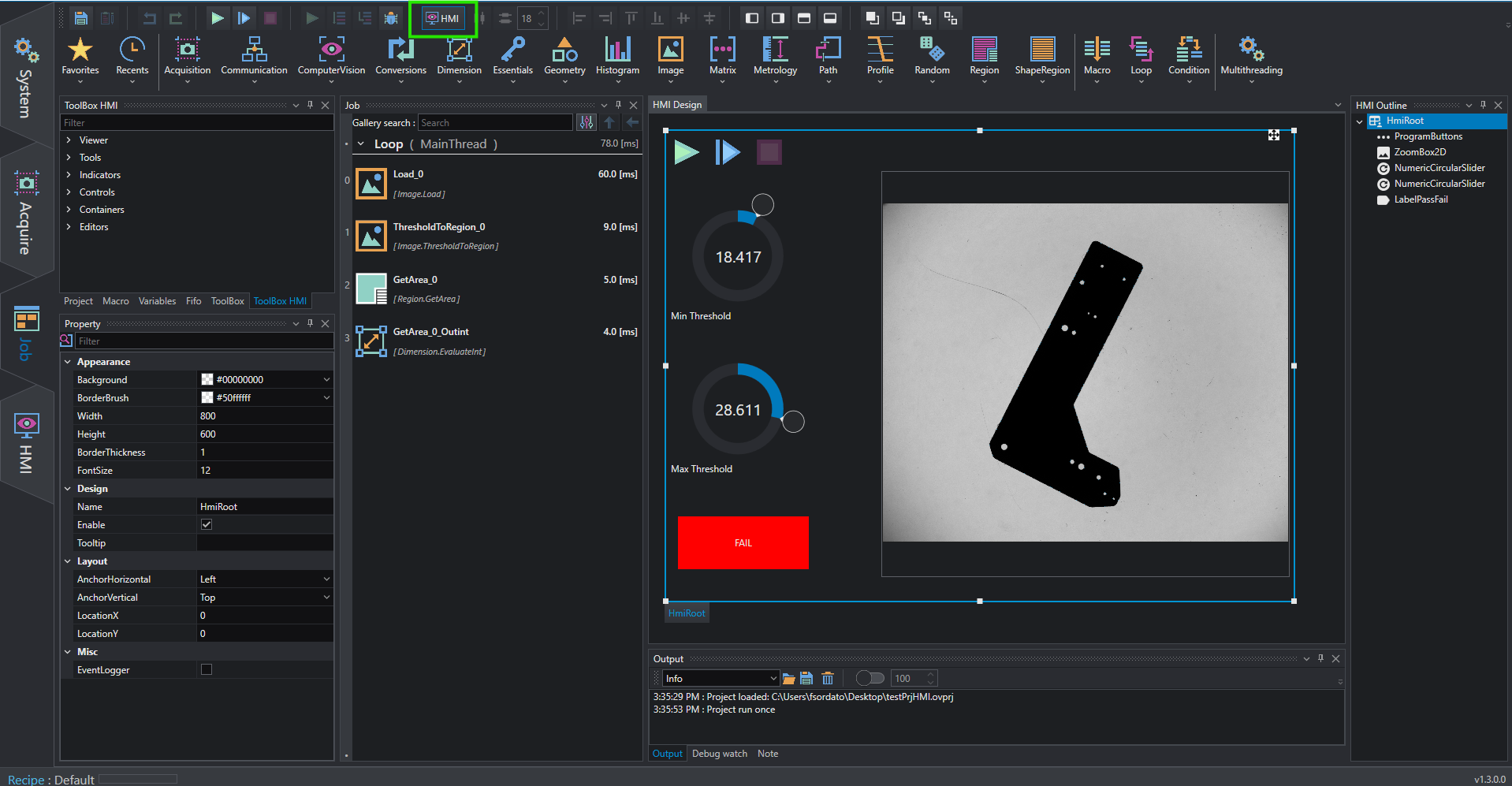
When HMI Designer is activated, several controls are available to design the controls layout.
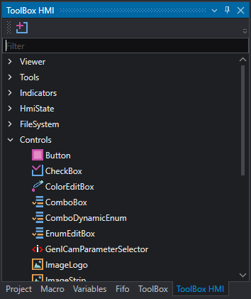
Toolbox HMI
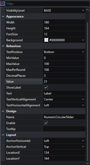
The toolbox contains all types of HMI controls that can be added to your design. It is automatically activated when the designer is opened. Read more about control properties in the HMI Controls reference.
To add a control to the HMI, drag and drop the desired item onto the HMI canvas.
To add a new WPF library based on a template integrated into OEVIS® use  button.
Design canvas
The design canvas is where all controls are rendered to display the layout of your HMI. Each control can be resized, moved or transferred into other containers by dragging it with the mouse.
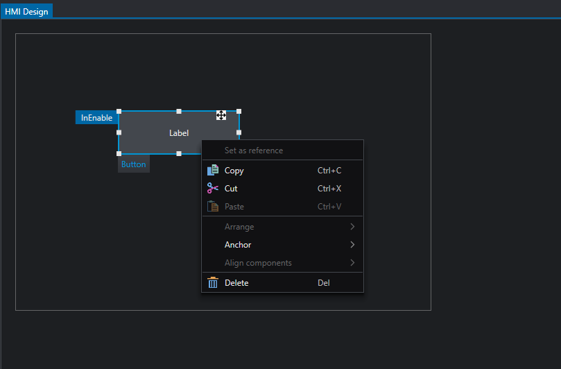
Context menu allows to perform quick and common actions for the selected control(s).
Toolbar
Quick actions can be performed from the toolbar to edit controls layout.

In particular, it is possible to control alignment and spacing of selected controls such as:
-
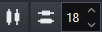
Space horizontally/vertically: set the same space between all selected controls along horizontal or vertical direction. Space value can be controlled with numeric box
-
Align elements: when multiple controls are selected, one control is set as reference (all white rectangular handles) and the others can be aligned to its left, right, top or bottom side or with respect to the center. If you want to change the reference control in the alignment process, right-click on the control then choose
Set as reference
-
Anchor control: dock the selected control to the left/right/top/bottom side of its parent container. If multiple controls are selected, then all items are docked in the same way. This function edits the control's alignment behaviour, so if a control is anchored to
rightthen when the parent container is resized from the right side the control will keep its position relative to that side.
-
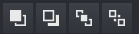
Arrange controls: edit the order in which controls appear by moving one item on top of the other or by setting it topmost or bottommost.
Property bar and linking
Controls can be customized in depth by editing their properties from the property bar, such as their layout, appearance and behavior.
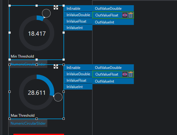
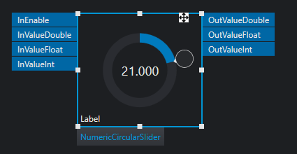
When a control is selected, some labels are displayed around it, depending on the type of control which is selected. These labels refer to properties that can be linked to Job's tools so that it's possible to control project's analysis and results.
To link a property to a control, follow the steps:
- Select the HMI control you want to use in the HMI Canvas
- Select the tool you want to link; the HMI control is still selected on the designer and tool's properties are displayed in the property bar
- Drag the property you want to control and drop it on the control label. If the property type is compatible, the label is highlighted green.
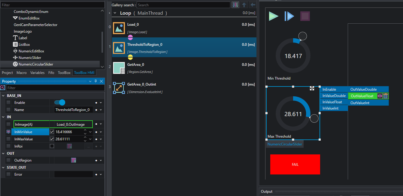
The label is now linked to the tool's property; from control's label, it is possible to view the linked property by clicking the View link button or delete the link. The tool's property, when selecting the tool in the job, is marked with the HMI icon to show that it is connected to a HMI control.
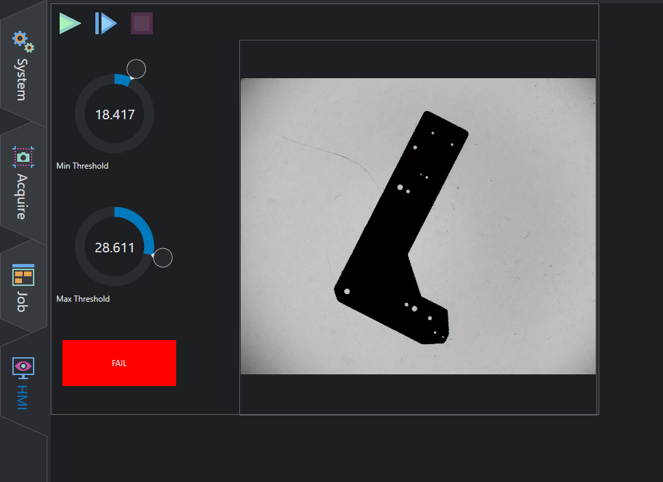
HMI Execution
During the design process, the HMI is in Design Mode, which means that its functionalities are disabled (buttons, switches, text box etc). To test the HMI and use controls you must move on the HMI panel.